Every brand video needs a moment where the logo lands. It is the first frame people see on a YouTube pre-roll, the last frame of a corporate case study, the three seconds that close a LinkedIn ad. Yet most logo animations fail for the same boring reasons: the source file was never prepared properly, the timing is off by a few frames, and the export codec kills the transparency. adobe.com has a solid rundown on this.
This guide explains how to animate a logo for video using the exact production workflow we follow at Meltin’Cast, stage by stage. No template gallery, no one-click generator. Just the process, the numbers, and the places where beginners lose the plot.
What “animating a logo” actually means in a video context
A logo animation is not a decorative effect. It is a short piece of motion design, usually between 1 and 4 seconds, built to do one of three jobs:
- Intro (logo sting): opens a video, sets the brand tone, usually 1.5 to 3 seconds.
- Outro (endcard): closes a video with the logo, a tagline and a call to action, usually 3 to 5 seconds.
- Overlay / bug: a small animated mark that appears in a corner or transitions between chapters.
Each one has different timing and different export requirements. Deciding which one you are building is step zero. If you skip it, you will animate a beautiful 6 second sting that nobody will ever watch on a social feed where the first 3 seconds decide everything.
Step 1: Prepare the logo file (where 80% of beginners fail)
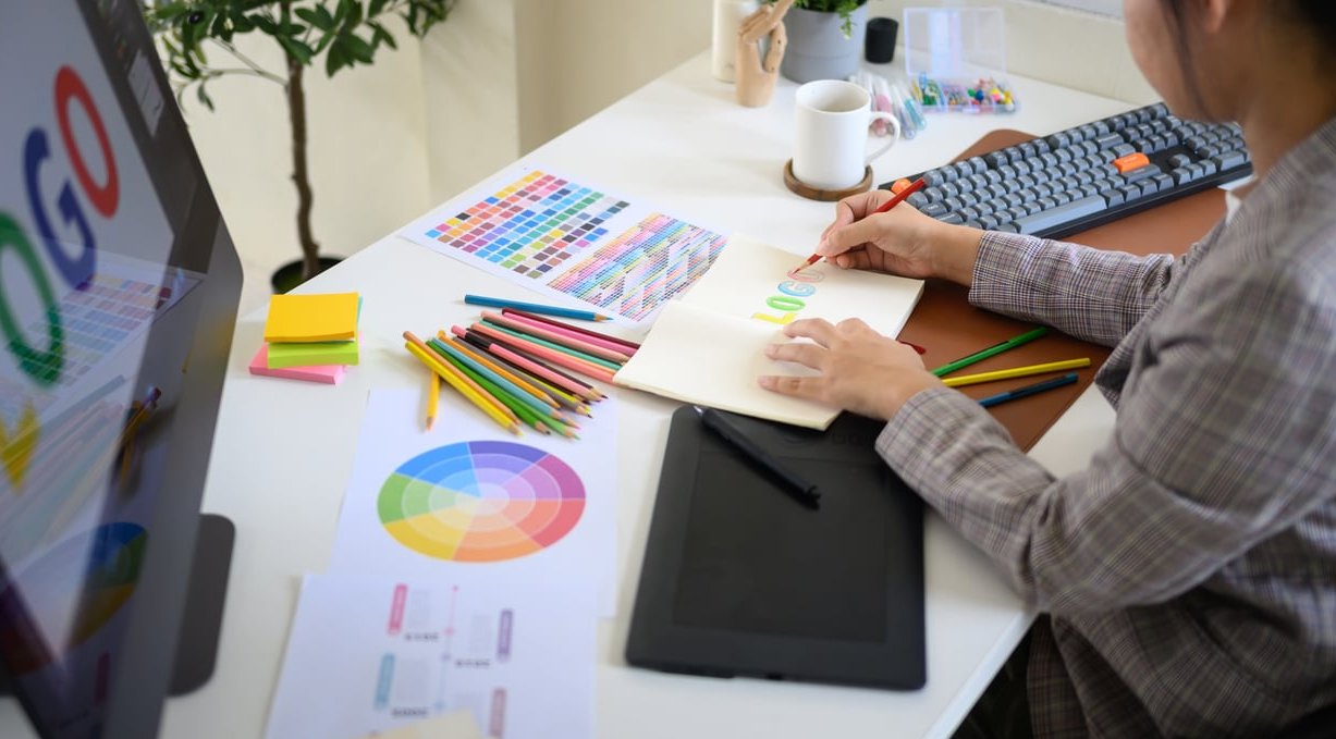
This is the least glamorous stage and the one that determines whether the animation is possible at all. A logo animation is only as good as the file you feed the software.
Start from vector, always
You need an .AI, .SVG or .EPS file. A JPG or a low-resolution PNG cannot be scaled, cannot be separated into layers, and cannot be stroked or masked cleanly. If all you have is a raster logo, the honest answer is that it must be redrawn in vector first. It takes an hour and saves the whole project.
The pre-flight checklist we run on every logo
- Separate every element onto its own layer: icon, wordmark, tagline, background shape, and each individual letter if you plan to stagger them.
- Name the layers logically (icon_left, icon_right, wordmark, tagline). Software imports layer names, and a file full of “Group 47” copies will cost you an hour of scrolling.
- Expand all strokes into shapes, unless you specifically want to animate a stroke drawing on (trim paths), in which case keep the stroke live and clean.
- Convert text to outlines so fonts never substitute on another machine.
- Switch the document to RGB, not CMYK. Video is RGB. A CMYK red will look muddy and desaturated once rendered.
- Remove clipping masks, compound path oddities and stray anchor points. They break when imported as shape layers.
- Center the artwork on a square artboard, ideally 1920×1920 px, with generous padding. It makes repositioning across formats trivial.
- Export a transparent PNG at 4000 px as a fallback for elements that do not need to deform.
The three prep mistakes we see every week
- One flattened layer. The client sends a single merged vector object, so nothing can move independently. Result: a logo that can only fade or scale.
- A tiny PNG with a white background. White is not transparency. Keying it out leaves grey fringing around every curve.
- Live text with a licensed font. The animation opens on another workstation and the wordmark silently becomes Arial.
Step 2: Choose the right tool for the job
The tool depends on the ambition and on who maintains the file afterwards. Here is how the options compare in practice.
| Tool | Best for | Alpha channel export | Learning curve |
|---|---|---|---|
| After Effects | Full control, broadcast and corporate delivery | Yes (ProRes 4444, PNG sequence) | Steep |
| Blender / Cinema 4D | 3D extrusions, metallic or glass logos | Yes | Steep |
| Jitter / Rive | Fast web and social animations, UI-friendly | Partial (WebM, Lottie) | Gentle |
| Canva / Adobe Express | Internal drafts, quick social posts | Limited | Minimal |
| Template generators | Testing an idea before committing | Rarely | None |
Our rule: template makers are fine for a placeholder or an internal deck. The moment the animation is going on paid media, a showreel or a client-facing corporate film, it needs to be built from your real vector file so the brand geometry stays exact.
Step 3: Design the movement before you touch a keyframe
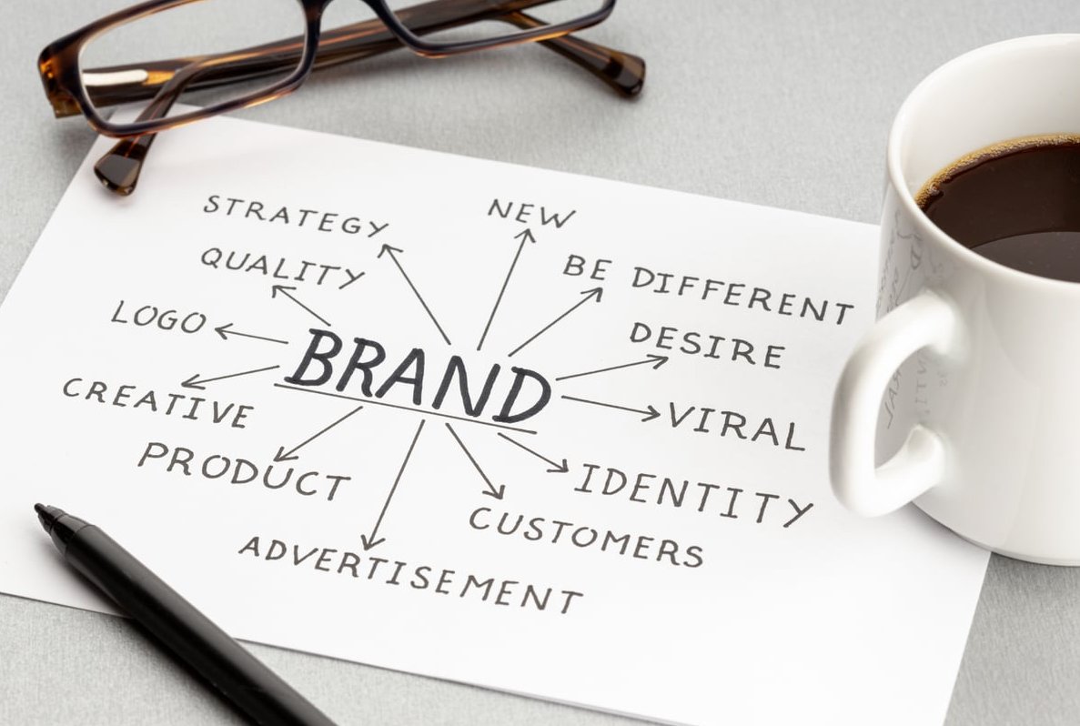
Open a notebook, not the software. The question is not “what effect do I apply” but what does this logo want to do. The construction of the mark usually tells you.
- Geometric mark built from separate shapes: assemble the pieces, each arriving from a different direction and snapping into place.
- Line-based or monoline icon: draw it on with trim paths, then reveal the wordmark.
- Bold wordmark only: mask reveal letter by letter, or a scale with a slight overshoot.
- Logo with a container or badge: the container expands, the content settles inside.
- 3D or reflective identity: a slow camera move with a light sweep across the surface.
Pick one clear idea. The most common amateur reflex is stacking three ideas at once: a rotation, plus a blur, plus particles, plus a glow. The eye cannot read all of it in 2 seconds, and the logo becomes noise.
Step 4: Nail the timing (the real difference between amateur and pro)
Timing is measured in frames, not in seconds. At 25 fps, one frame is 40 ms. At 30 fps, it is 33 ms. Shifting a keyframe by 3 frames changes the entire feel of an animation.
Reference durations we work with
| Use case | Total duration | Hold on final logo |
|---|---|---|
| Social intro (Reels, TikTok, Shorts) | 0.8 to 1.5 s | 0.3 s |
| Corporate film intro | 2 to 3 s | 0.8 to 1 s |
| Video outro / endcard | 3 to 5 s | 2 s minimum |
| Broadcast or cinema sting | 3 to 5 s | 1.5 s |
| Corner bug / overlay | 0.5 s in, 0.5 s out | Variable |
Three timing principles that fix most amateur animations
- Stagger, never sync. If five elements arrive at the same moment, the animation looks flat. Offset each one by 2 to 5 frames. That tiny delay is what creates rhythm.
- Fast in, slow settle. Movement should cover most of its distance in the first 30% of its duration, then decelerate. Roughly 8 to 14 frames of travel, then a settle.
- Always hold the final frame. The logo must be perfectly still and legible for at least 15 frames at the end. Beginners cut the moment the animation stops, and the brand never actually registers.
Test it honestly: play the animation at full speed on a phone. If you cannot read the wordmark on first viewing, it is too fast or too busy.
Step 5: Easing, the part nobody sees but everybody feels
Linear keyframes are the giveaway of a beginner animation. Real objects accelerate and decelerate. Easing is how you translate that into motion design.
Which easing curve for which move
- Ease out (fast start, soft landing): the default for elements entering the frame. Roughly 0% influence on the way in, 70 to 85% on the way out.
- Ease in and out: for camera moves, slow drifts and scaling backgrounds.
- Overshoot: the element goes 3 to 8% past its final position, then settles back. Perfect for playful or dynamic brands. Keep the overshoot subtle for legal, finance or medical clients.
- Anticipation: a small move in the opposite direction, 2 to 4 frames, before the main action. It makes assemblies feel intentional.
In After Effects, do not stop at F9. Open the graph editor and look at the velocity curve. If the curve is a straight diagonal, the movement is mechanical. If it is a steep rise followed by a long tail, it will feel natural.
One useful extra: add motion blur as soon as elements move quickly. Without it, fast movement strobes and looks cheap. With a shutter angle around 180 degrees, the same animation instantly looks like it was made by a professional.
Step 6: Add sound accents (the biggest return on the smallest effort)
An animated logo without audio feels incomplete. Sound is not decoration, it is what makes the movement land. Two or three well-placed accents change everything.
The sound structure we use
- Whoosh on the entry movement, starting 3 to 5 frames before the visual movement begins. Sound anticipates the image, never follows it.
- Impact or click on the exact frame where the final element locks into place.
- Tail or riser: a short reverb, chime or sub bass that carries the hold on the final logo.
- Optional signature: a 2 or 3 note motif taken from the brand’s audio identity, if one exists.
Technical points that matter
- Mix the sting around -14 LUFS for web and social, with true peak below -1 dBTP.
- Leave 6 to 10 frames of silence after the last accent so the sting can be cut cleanly into any edit.
- Always deliver a mute version too. Broadcast, exhibition screens and autoplay banners often need it.
- Check the license of every sound effect. A free download is not automatically usable commercially.
Step 7: Export correctly for each destination
This is where a good animation gets ruined. The main issue is transparency: an H.264 MP4 cannot carry an alpha channel. If you need your logo to sit over footage in an editing timeline, you need a different codec.
| Destination | Format | Resolution | Notes |
|---|---|---|---|
| Master / archive | ProRes 4444 or PNG sequence | 3840×2160 | With alpha, this is the file you re-export from forever |
| Editing overlay | ProRes 4444 / QuickTime Animation | 1920×1080 | Straight alpha, unmultiplied |
| YouTube / corporate site | MP4 H.264 | 1920×1080, 25 or 30 fps | Bitrate 15 to 20 Mbps |
| Reels / TikTok / Shorts | MP4 H.264 | 1080×1920 | Reframe, do not just crop |
| Feed / LinkedIn square | MP4 H.264 | 1080×1080 | Keep 10% safe margin |
| Website / email signature | WebM with alpha, GIF or Lottie | 800 px wide max | Lottie stays razor sharp and weighs a few KB |
| Presentations | MP4 or GIF | 1920×1080 | Loop version useful for standby screens |
Frame rate warning: match the frame rate of the video the logo will be edited into. A 24 fps sting dropped into a 25 fps timeline will judder on the fastest movements, and nobody will know why. It is argued more carefully on glowzadigital.com.
Step 8: Deliver a proper logo animation kit
When we hand over a logo animation, the client does not receive one file. They receive a kit, because a logo animation is a brand asset that will be reused for years.
- Intro version and shorter outro version
- Horizontal (16:9), vertical (9:16) and square (1:1) formats
- Light background and dark background versions
- Alpha channel master for editors
- Sound version and mute version
- Lottie or GIF for web and email
- Editable project file with organised layers
The mistakes that ruin most DIY logo animations
- Animating from a JPG. No transparency, no layers, no scaling.
- Too many effects at once. One clear idea beats four competing ones.
- Linear keyframes. Motion without easing always reads as amateur.
- No hold at the end. The brand never gets a chance to register.
- Deforming the logo. Non-uniform scaling, skewing or over-stretching breaks brand guidelines. The logo can move, it should not be distorted.
- Ignoring safe areas. On vertical formats, platform UI covers the bottom 15% of the screen.
- Exporting once, in one format. Then re-cropping badly for every new platform six months later.
- Sound arriving after the movement. Even 2 frames late feels wrong to the viewer, even if they cannot explain why.
Template maker or custom animation: how to decide
Online generators genuinely have their place. Use one if you need a quick asset for an internal video, if your logo is simple, and if the animation will not be seen by thousands of people. They are fast and cheap.
Go custom when:
- The animation will run on paid media or on a national campaign
- Your logo has a specific construction that deserves a meaningful movement
- You need alpha channel files for an editing team
- You want a signature audio accent that becomes recognisable
- You need consistency across dozens of videos over several years
A generated template will look like fifty other brands using the same preset. A custom animation encodes something about your identity into 2 seconds of movement, and that is the whole point.
FAQ: animating a logo for video
What can I use to animate a logo?
Adobe After Effects remains the professional standard for 2D logo animation, with Blender or Cinema 4D for 3D work. For faster, lighter projects, Jitter, Rive and Adobe Express work well. Canva and online logo animation makers are suitable for drafts and simple internal content.
Can ChatGPT animate a logo?
Not directly. AI tools can help you generate concepts, write animation briefs, produce expression code or scripts for After Effects, and suggest timing structures. The actual animation still needs to be produced in motion design software, or through an AI video generator whose output rarely respects exact brand geometry.
How can I animate a logo for free?
Use Blender (free and open source, capable of both 2D and 3D), the free tiers of Jitter or Canva, or an online logo animation maker with a free export option. Watch out for watermarks and for the absence of transparency in free exports, which is the most common limitation.
How do I convert a logo into a video?
Import your vector logo into a motion design tool, animate its layers over a short timeline, add sound accents, then export as an MP4 for playback or as ProRes 4444 with alpha if the logo needs to sit over other footage in an edit.
How long should an animated logo be?
Between 1 and 3 seconds for an intro, and 3 to 5 seconds for an outro that includes a call to action. On social platforms, keep intros under 1.5 seconds so you do not spend your entire attention window on branding.
Which file do I need to give my agency?
A layered vector file (.AI, .SVG or .EPS) with named layers, expanded strokes, outlined text and RGB colours. Add your brand guidelines with the exact colour values and clear space rules. With that, an animation can start immediately.
Can the same logo animation be used everywhere?
The animation idea should stay identical, but the deliverables must be adapted. Different aspect ratios, different durations, sound and mute versions, light and dark backgrounds. That consistency across formats is exactly what builds recognition. This reference is the one worth keeping handy.
Ready to see your logo move?
A logo animation is a small asset with a long life. Built properly, it appears at the start or end of every video your brand publishes for the next five years. Built quickly from a flattened PNG and a preset, it becomes the thing you quietly avoid using.
At Meltin’Cast, we handle the whole chain: file preparation, animation design, sound accents and the full multi-format export kit. Get in touch with us to talk about your logo and how it should move.